Sifting through data sounds clinical, but journalists can use it to seek out the human element when reporting on natural disasters such as earthquakes
In the first moments when an earthquake strikes a city or any part of the world, there's a limited window of time to sift through heaps of data circulating on media outlets and digital platforms.
We must quickly answer the fundamental questions that may well be life-changing for people: Did the earthquake actually occur? Where? With what magnitude? What are the preliminary outcomes? Which areas require immediate intervention? And how can we minimise the losses as much as possible?
After we've sifted through and removed inaccuracies from the news circulating on social media, and have separated the verified information and genuine images of the earthquake from the incorrect and misleading, a deeper, more comprehensive coverage is required.
The database can be our avenue for achieving this. But where do we start and what specifically should we do?
Predicting earthquakes reliably is difficult - sometimes, tremors occur without us even noticing.
Database plays a crucial role in understanding what has happened, in assessing the scale of the losses, and in preparing for similar phenomena in the future.

Which stories should we report?
Depending on the size of the earthquake and the damage it has caused, several focus points can help amidst the flood of news during times of crisis:
- Magnitude and impact: Which areas did the earthquake hit? Which are most affected?
- Horizontal and vertical comparisons: Here, we can compare the current earthquake to the history of seismic activities known, which we term as vertical comparison. Then, we provide rankings and comparisons to nearby areas, known here as horizontal comparison.
- Historical analysis: This allows us to scrutinise the earthquake data records over an extended time period. We can identify the locations where earthquakes have previously concentrated and in which city or country.
- Explanatory designs: Data can help us to explain the phenomenon of earthquakes to the public and engage the audience in the exploration process in a way that helps us understand how specific buildings and areas are affected by different magnitudes of earthquakes.
- Scale of losses: By using satellite data, we can present a comprehensive visualisation and analysis of the effects caused by the earthquake on the ground.
- Verification: Data can be used to validate claims regarding the severity of an earthquake or the losses it has caused, especially if there are claims that it is the strongest in decades or otherwise.
Data also helps us contextualise as numerous factors contribute to the extent of earthquake damage such as population density, architectural design and more.
There's no one-size-fits-all template for earthquake coverage and the use of data in reporting on it. Earthquakes surprise us, as do the numbers associated with them, requiring us to make multiple editorial decisions in a limited timeframe.
This could increase the possibility of making mistakes. We will also have to deal with numerous figures and statistics and need to know how to incorporate these numbers into the narrative.
Examining your data
Gathering data during an earthquake is a time-sensitive exercise. But, when using international databases that continuously monitor and record earthquakes, and although your editors may expect you to produce a data-driven report on earthquakes that have struck the area over the past decade, take a moment to review the methodology of the sources you're dealing with.
There are always limitations to the data you're working on, so try to identify them and ensure you can explain them to the public. Seek expert advice when needed.
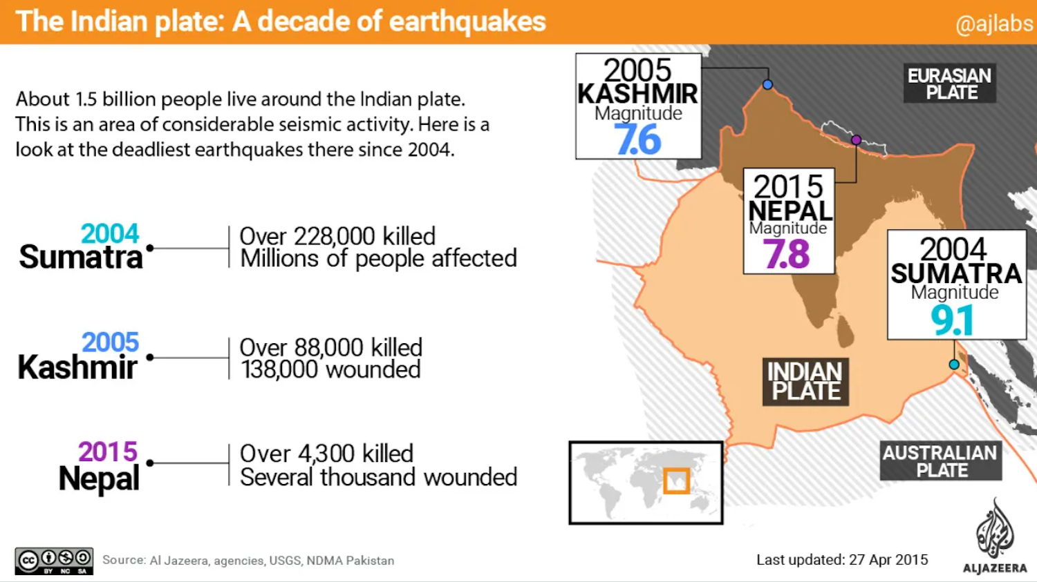
When examining the methodology of earthquake data collection, don't forget the descriptive data that helps you understand the data at hand and how to deal with it.
Understanding the methodology and accuracy of data collection is the backbone on which the story will rely; without it, you're vulnerable to scrutiny after publishing.
In addition to that, don't neglect the data filtering phase amidst the rush of a crisis.
Also, try to frame your questions during data analysis within the context of earthquakes.
Aside from questions like: "Was this the strongest earthquake in the country's history?" or: "Are the losses unprecedented?", consider questions such as: "How does this earthquake differ from previous ones?" and: "What can previous earthquake data tell us about mitigating its impact?"
Presenting your findings
Collecting, filtering and analysing data are hidden stages that the public doesn't see. Regardless of the effort and time required, it's all in vain if the story isn't presented clearly and engagingly.
We need to choose the most suitable visual formats and interpretive methods, without overlooking expert opinions, specialists and the human stories behind the numbers.
Maps
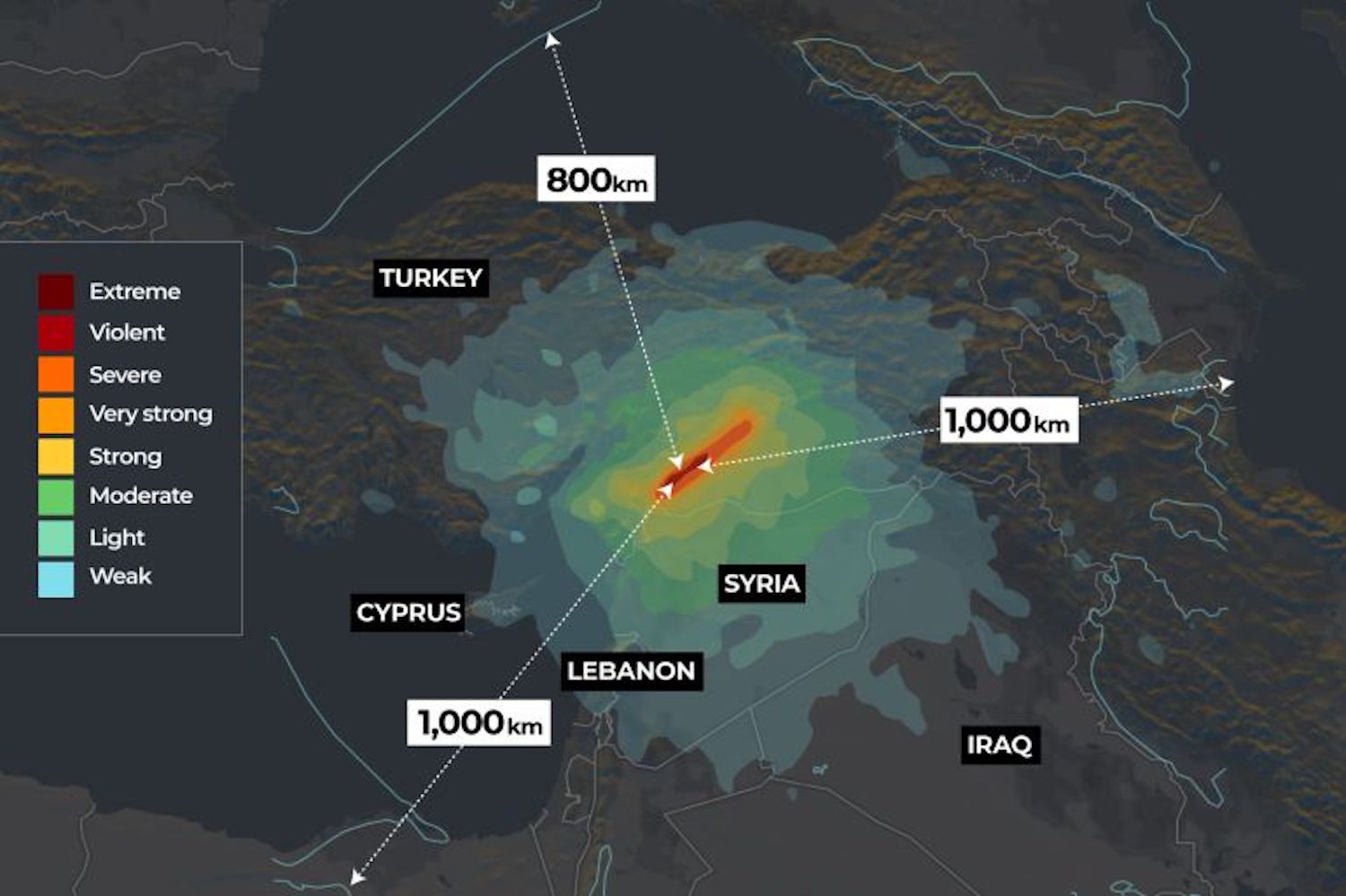
There are various types of maps that can help us display the distribution of earthquakes and seismic activities that may go unnoticed in a specific geographic area or globally.
Maps also allow us to visually present variations in earthquake intensity across different regions or time frames. Moreover, continuously updated maps can keep the public informed about ongoing seismic activities.
Timelines
A single earthquake goes through several phases, leading to aftershocks. There's also the trajectory of announcing losses, aid intervention and rescue news.
These can be better narrated and clarified through timelines, allowing the public to follow different phases and understand the scale of damage and aid.
Scatter graphs
Scatter graphs allow for the display of correlations and can be used to explain the relationship between earthquake magnitudes and the risks they pose in different urban and environmental contexts.
Humanising the numbers
It's easy to track the number of victims. Have they reached a hundred, a thousand or a hundred thousand?
These numbers might look similar; a large number may signify that many people have died, but that's hard to grasp. It's difficult for us to imagine large numbers, but we can offer stories that use data to portray the victims, by putting a name behind each number.
Some media outlets do this in wars and have also published similar stories about COVID-19 victims. We would need a database detailing the victims. We could also sketch a general picture of the victims by knowing their age groups, their cities and other variables.
The idea here is to humanise the victims, not treat them as mere continuously updated numbers.
Data with new dimensions
The bulk of work in data journalism takes place in front of a computer. Additional tasks may be assigned to journalists, such as speaking to sources and narrating human stories.
However, data allows journalists to consider earthquakes in terms of scale and impact. It enables them to work on comparisons with different dimensions and also to produce explanatory content that helps them better understand these phenomena.
Furthermore, data can identify areas that have suffered less damage and allow for the verification of information that may circulate about seismic events as soon as they occur.
In summary, through the use of data, we inform, clarify, scrutinise, and most importantly, reveal what the numbers tell us about people; about lives that have ended and lives that have just begun.
Translated from the original Arabic by Yousef Awadh
